
How to Arrange Large Anime Figures Without Blocking Smaller Ones
A mixed-scale figure shelf can look incredible when it is planned like a scene instead of filled like storage. For shoppers exploring this further, see scale figures. The problem is that large scale figures naturally steal height, width, and visual weight. If you place them first without thinking about sightlines, your smaller figures disappear behind skirts, weapons, effect parts, and oversized bases.
The fix is not to stop mixing sizes. It is to assign each figure a job. Large figures should anchor the display. Smaller figures should add rhythm, detail, and story without getting buried.
If you are still working out shelf dimensions, it helps to start with a size plan before you start moving everything around. This shelf depth guide explains the measurement side well: How Deep Should a Shelf Be for Anime Figures? A Size Planning Guide
Why mixed-size displays become hard to read
Collectors usually run into the same three problems:
1. **Tall figures create a visual wall.** Hair, capes, wings, and weapons turn one centerpiece into a barrier.
2. **Small figures get placed flat on the same plane.** When everything sits at one height, the shortest items lose immediately.
3. **Bases eat more room than expected.** A large circular or dynamic base can claim the front half of a shelf before you notice.
A shelf reads well when the eye can move from the hero piece to the supporting figures without hitting a visual block. Think in terms of height tiers, open gaps, and angle control, not just available inches.
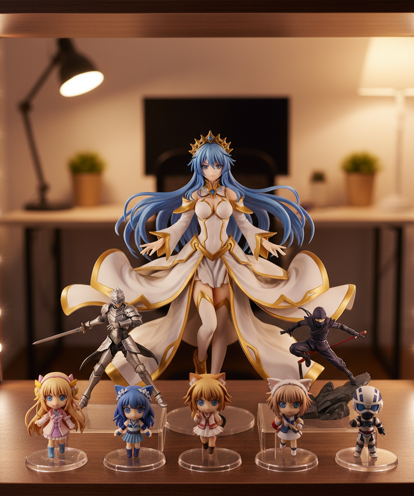
Start with the biggest figure, but do not center it automatically
A common mistake is putting the largest figure dead center, straight forward, at the very front. That sounds logical, but it usually creates the worst possible sightline issue.
Instead, test the big figure in one of these positions:
- **Back-center** when the pose is vertical and the silhouette is clean
- **Back-left or back-right** when the figure has wide accessories on one side
- **Slight diagonal angle** so effect parts sweep away from smaller figures rather than across them
The goal is to let the largest piece feel like the anchor without acting like a curtain.
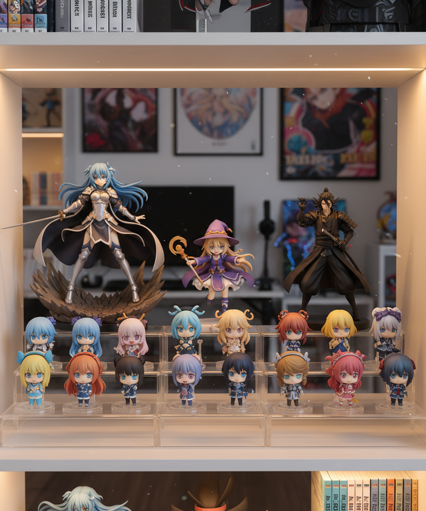
Use a simple three-zone shelf layout
For most collectors, the easiest way to display large and small anime figures together is to divide one shelf into three functional zones:
| Zone | Best use | What goes there | Main rule |
|---|---|---|---|
| Back zone | Height and anchor presence | 1/7, 1/6, tall prize, or dynamic centerpiece figures | Keep the tallest silhouette behind the smaller pieces |
| Mid zone | Secondary support | Medium prize figures, busts, or narrower scales on risers | Offset them so they do not line up into a wall |
| Front zone | Fine detail and readability | Nendoroids, trading figures, mini figures, acrylics, or low-profile items | Nothing tall enough to hide the row behind it |
This is the core principle: big in back, small in front, but staggered rather than stacked in a straight line.
A practical mixed-scale layout that works
Here is a reliable shelf arrangement for one large centerpiece, two medium figures, and several smaller ones.
Top view of one shelf

+------------------------------------------------------+
|   [Large centerpiece]         [Medium figure]        |
|        \                             /               |
|         \                           /                |
|   [small riser]    open gap    [small riser]         |
|     [mini] [mini]             [mini] [mini]          |
|                                                      |
| [low-profile item]      [low-profile item]           |
+------------------------------------------------------+
Front edge
What matters in this layout:
- The **large centerpiece sits behind the front line**, not on it.
- The **medium figure is offset**, so it complements the big figure instead of forming a second wall.
- The **open gap in the middle** gives the eye somewhere to rest.
- Smaller figures sit on **low risers** or in clean front clusters where their faces stay visible.
That open negative space is doing real work. Shelves become chaotic when every inch is occupied.
How to use risers without making the shelf look like stadium seating
Risers are essential, but bad riser use can make a display feel mechanical.
Use them for visibility, not for turning every row into a staircase.
Better riser rules
- Use **one or two low risers** instead of multiple tall levels on a shallow shelf. For shoppers exploring this further, see acrylic risers for anime figures.
- Put risers under **small or mid-size figures**, not under the biggest centerpiece.
- Choose clear acrylic or shelf-colored risers so the arrangement stays visually light.
- Leave a little empty area around the riser so it looks intentional rather than crammed.
A good rule of thumb is that a riser should reveal a face, torso, or key prop that would otherwise be hidden. If it only makes the shelf busier, remove it.
Stagger depth, not just height
Many collectors think only in vertical layers, but depth is just as important.
If your large figure has a broad base, do not place smaller figures directly in front of the widest part. Put them in front of the narrow side of the silhouette or slightly to either side of the base footprint.
Try this sequence:
1. Put the large figure at the back.
2. Step back and identify where its silhouette is thinnest.
3. Place medium or small figures in those thinner sightline lanes.
4. Rotate figures a few degrees until faces are readable from your normal viewing angle.
Sometimes a ten-degree turn solves more than a full shelf rearrangement.
Treat the shelf like a composition, not a lineup
Mixed-scale displays look best when they feel like a scene. That means figures should relate to each other by theme, color, motion, or character energy.
For example:
- A powerful 1/7 battle pose can anchor the back corner.
- Two smaller companion characters can sit forward on opposite sides.
- A compact bust or chibi can fill the front-center only if it does not cover the main base details.
If every figure faces straight ahead and sits shoulder to shoulder, even expensive pieces start to look like retail stock. For shoppers exploring this further, see collectible statues.
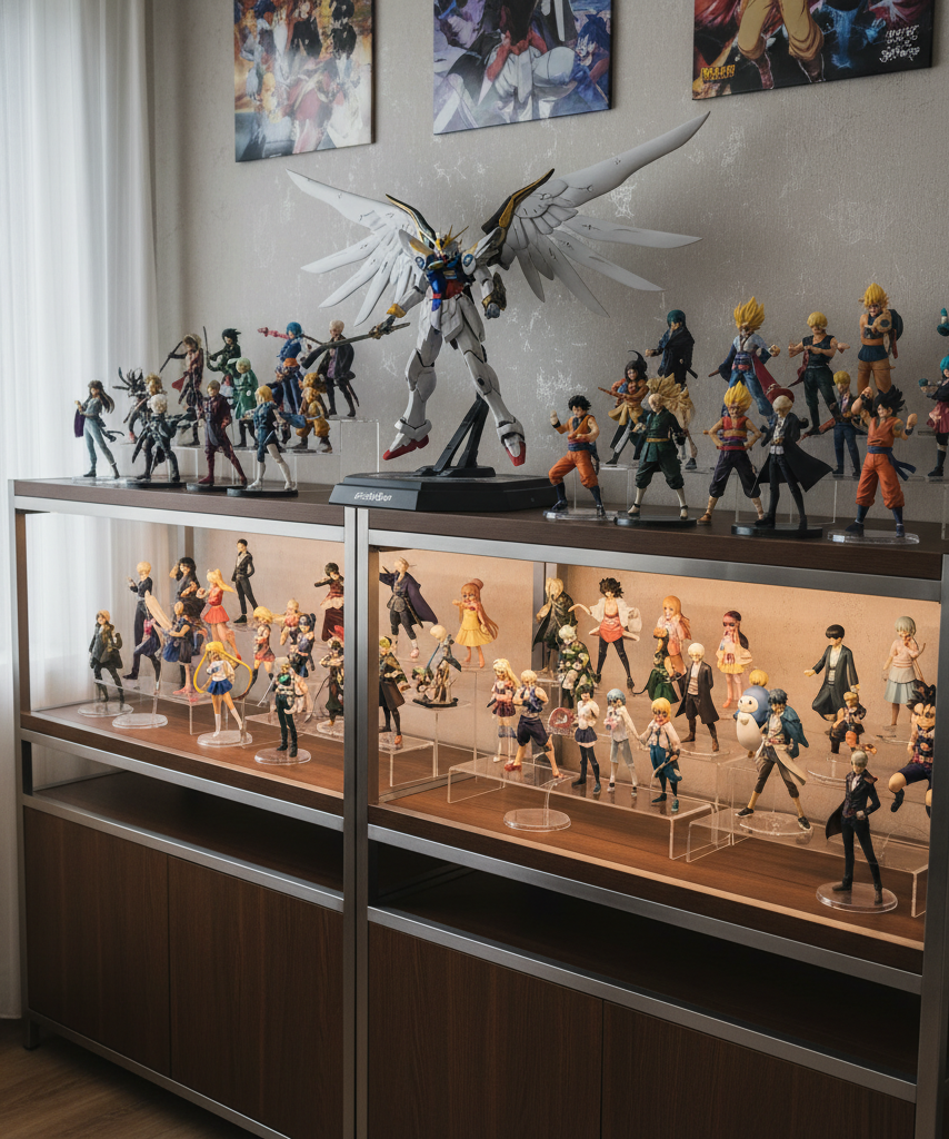
When to split one shelf into micro-displays
Sometimes the real answer is that one shelf should stop trying to be one big group. If you have multiple oversized figures with large bases or flowing effects, split the shelf into two or three micro-displays.
A micro-display can be as simple as:
- **Left third:** one large hero figure with one small companion
- **Center third:** breathing room or a short accent piece
- **Right third:** one medium figure with two minis
This works especially well when your collection mixes scales, lines, or art styles. It prevents one giant centerpiece from visually swallowing everything nearby.
Example layout planning by figure type
| Figure type | Ideal placement | Why it works | Watch out for |
|---|---|---|---|
| Large scale with wide effects | Back corner, slightly angled | Uses corner depth and keeps effects sweeping outward | Wings, swords, and translucent effects hiding nearby faces |
| Large scale with narrow upright pose | Back center | Strong focal point without spreading too wide | Front placement that blocks the entire shelf |
| Medium prize figure | Mid zone or rear opposite side | Bridges the scale gap between big and small pieces | Lining up several medium figures into a second wall |
| Nendoroid or mini | Front zone, sometimes on low riser | Keeps expressions readable | Tall accessories covering figures behind them |
| Bust or acrylic stand | Front-center or front side | Fills low space without blocking much | Reflective clutter if too many are grouped together |
Common layout mistakes that hide detail
1. Putting the largest base at the front edge
This wastes depth and makes everything behind it disappear.
2. Making every figure face perfectly forward
Some figures display better at a slight turn, especially when hair, weapons, or flowing costumes extend to one side.
3. Using too many figures of similar height in one row
That creates a fence effect. Break the line with one lower piece or a small gap.
4. Ignoring how the shelf is actually viewed
A shelf seen from below needs different height control than one viewed straight on at desk level.
5. Filling every empty spot
Collectors often think empty space means wasted space. It does not. Empty space is what lets the featured figures breathe.
A step-by-step reset for an overcrowded shelf
If your current setup feels messy, reset it in this order:
1. Remove everything from the shelf.
2. Put back only the largest figure.
3. Add one medium figure that supports it without covering it.
4. Add smaller figures only where faces and silhouette details remain visible.
5. Stop when the shelf looks finished, not when every figure is back.
That last step is the hardest one, but it is usually the difference between a collector display and storage overflow.
Lighting can either save or ruin the arrangement
Lighting will not fix blocked figures, but it can make a good layout much clearer.
- Use **top-front LED strips** to illuminate faces in the front row.
- Avoid harsh side lighting that throws large figure shadows across smaller ones.
- If one oversized figure dominates the light, soften that hotspot so the supporting figures still read.
A mixed-scale shelf should have one main focal point, but the surrounding figures should still be legible at a glance.
The best mindset: prioritize visibility over quantity
The best anime figure shelf organization usually comes from showing fewer figures more clearly. A large centerpiece deserves room. Smaller figures deserve sightlines. If one shelf cannot do both, divide the collection by theme, rotate displays seasonally, or move a few pieces elsewhere.
A good mixed-scale layout feels intentional from across the room and rewarding up close. You should notice the centerpiece first, then discover the smaller figures one by one instead of realizing later that they were hidden the whole time. For shoppers exploring this further, see creative display ideas for small rooms.
Final takeaway
To arrange large anime figures without blocking smaller ones, build the shelf in layers: anchor the biggest piece in the back, offset medium figures, lift only what needs visibility, and protect open sightlines in the front. Once you stop treating the shelf like a straight row and start treating it like a composition, both your showpiece figures and your smaller favorites get to matter. For shoppers exploring this further, see display cases.