


Description
Collector Overview
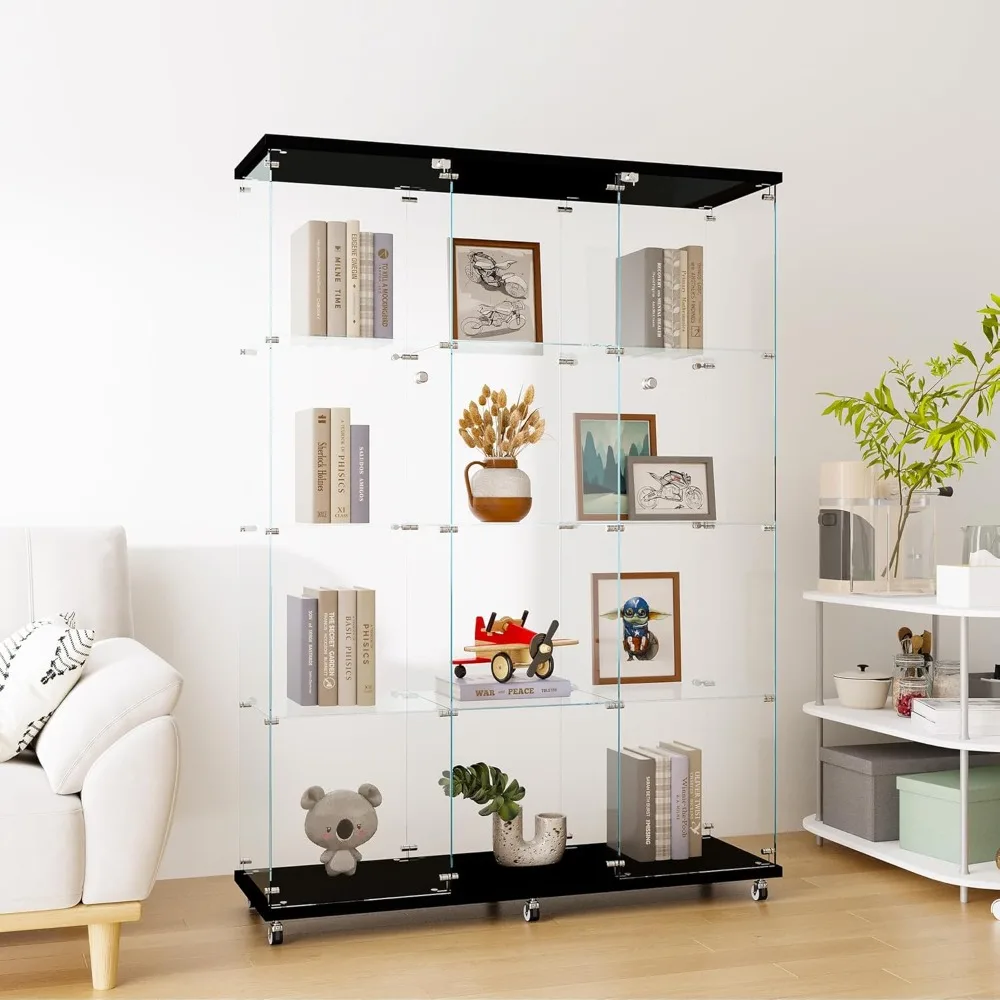
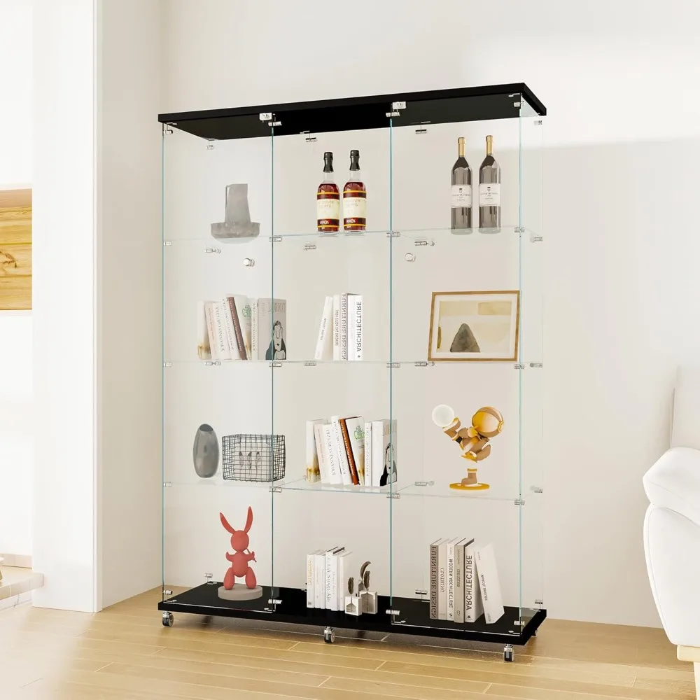
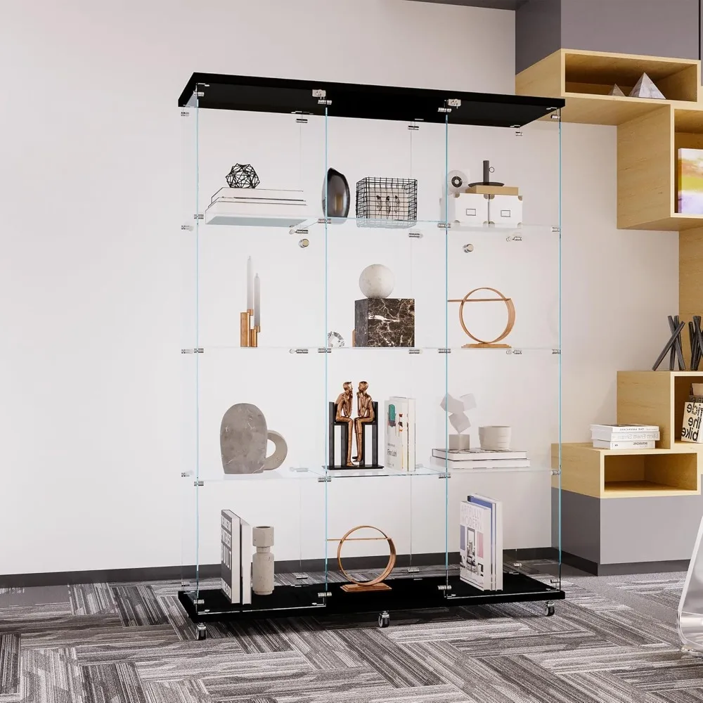
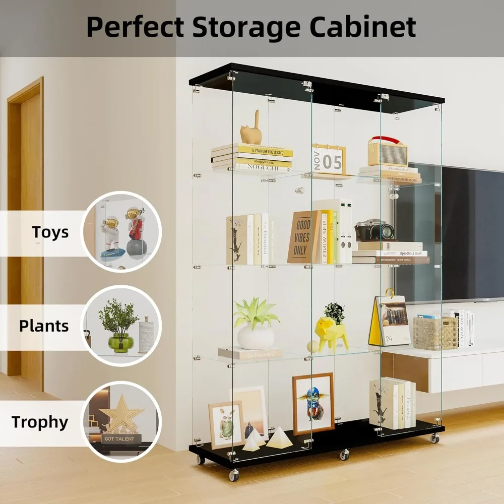
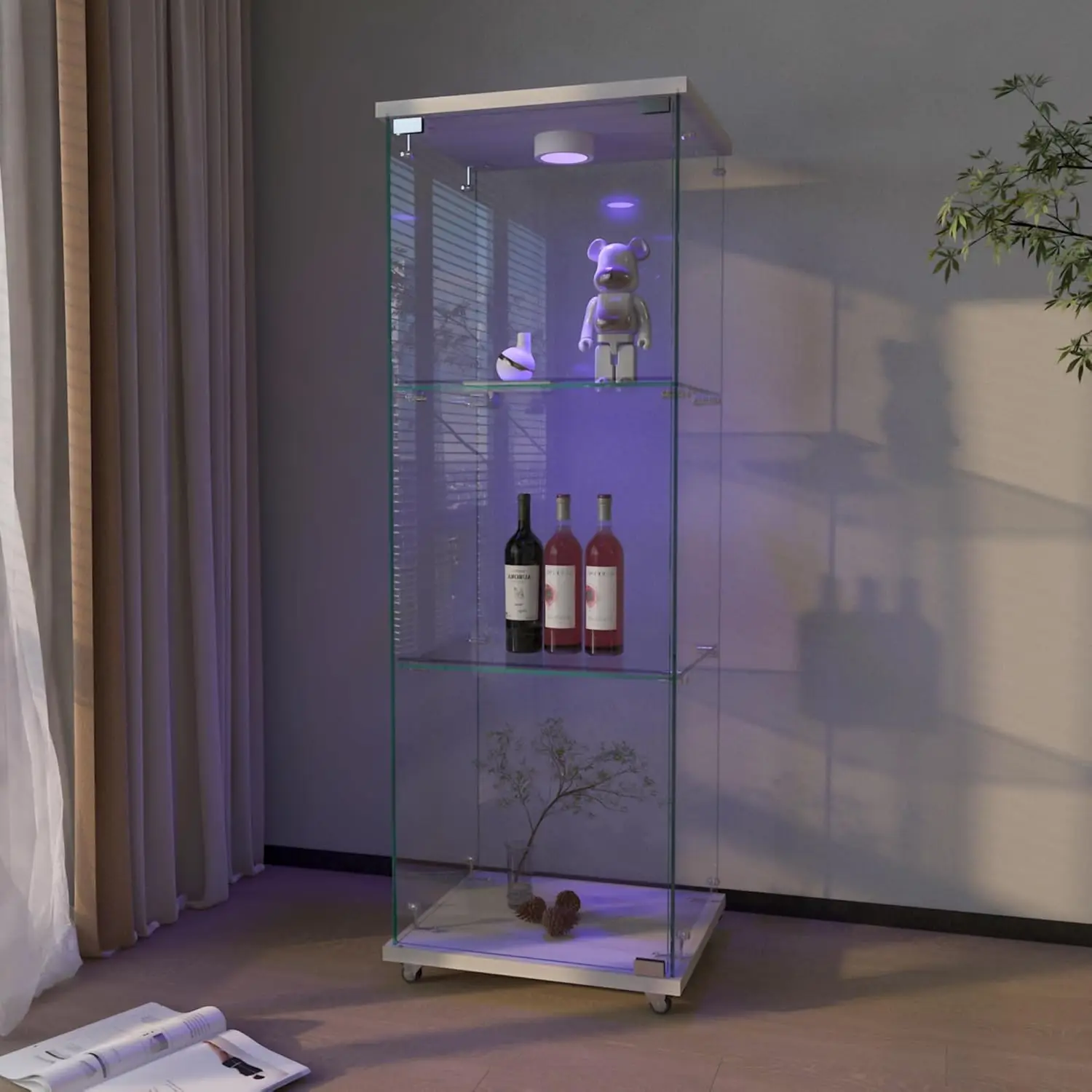
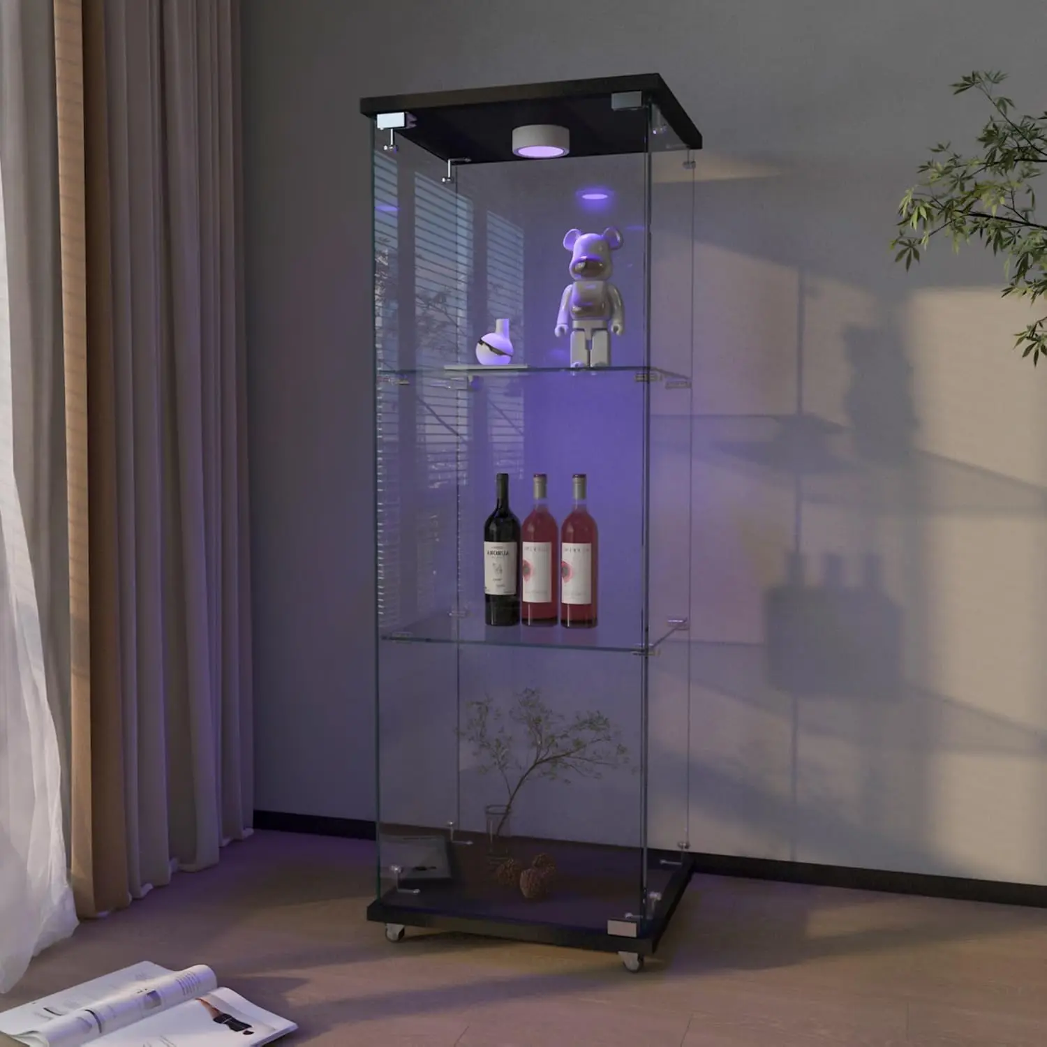
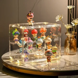
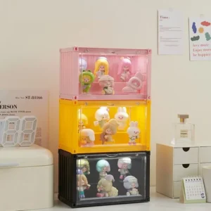
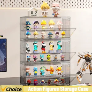
This display case helps organize and present figures, models, or small collectibles.
- Display and storage-focused format
- Helps keep collectibles organized and easier to view
- Review dimensions, selected option, and product images before checkout
Please check the product images, selected option, size details, and shipping policy before ordering.
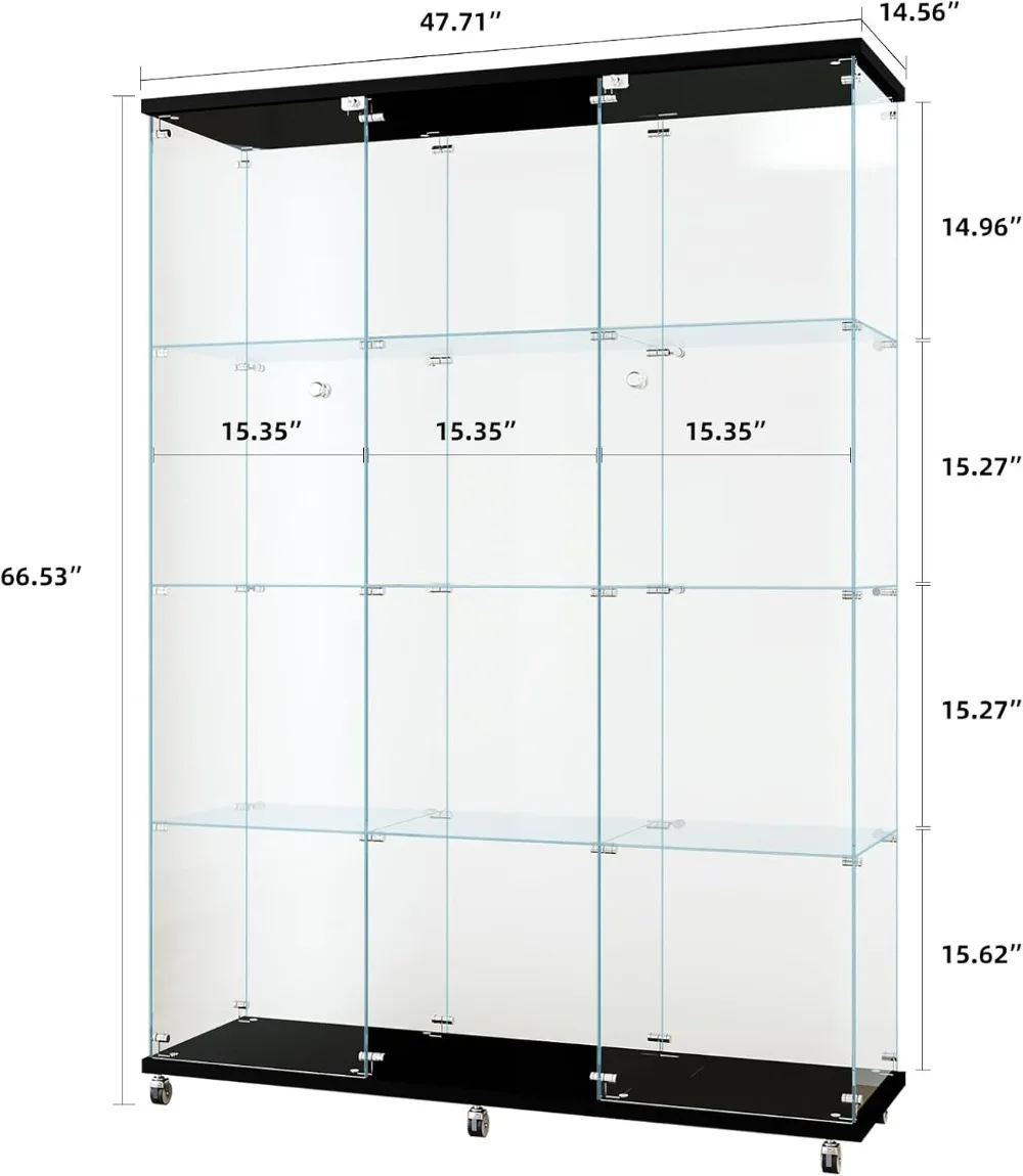
SPECIFICATIONS
Appearance: Modern Style
General Use: Home Furniture
Installation Method: Assembly
Size: 47.64″D x 14.57″W x 66.14″H
Specific Use: Bookcase
Type: Living Room Furniture
Reviews
There are no reviews yet.