
How to Display Anime Figures in Front of Their Boxes Without Blocking the Sculpt
To display anime figures in front of their boxes successfully, keep the box slightly recessed, avoid glare-heavy lighting, and make sure the packaging frames the figure instead of visually overpowering it. The goal is not to show the entire box at all costs. The goal is to use the box art as a backdrop that supports the figure silhouette, preserves shelf depth, and keeps the sculpt as the main focal point.
If you want the short rule, the box should sit far enough back to read as background, while the figure should sit far enough forward to keep its face, pose, and outline fully legible. When the packaging starts competing with the figure instead of framing it, the display stops looking premium and starts looking cramped.
Quick Answer: When Box-Backdrop Displays Work Best
Displaying anime figures with boxes works best when three things are true:
- the box art is attractive enough to add value as a backdrop
- the figure has a clean silhouette that stays readable in front of the packaging
- the shelf has enough depth to separate foreground and background instead of flattening them together
Box-backdrop displays usually look strongest with premium scale figures, character boxes with tasteful art direction, and shelves where you want a curated collector look instead of a minimal museum-style setup. For shoppers exploring this further, see premium scale figures.
They usually look weaker when the box is oversized, the figure base is bulky, or the shelf is so shallow that the packaging ends up touching the sculpt visually.
Step-by-Step Layout Guide for Displaying a Figure in Front of Its Box
1. Start with the figure, not the packaging
A lot of collectors do this backward. They center the box first, then try to squeeze the figure into whatever space is left. That is why the sculpt ends up looking crowded.
Instead, place the figure where it looks best from your normal viewing angle. Check the face visibility, body line, pose direction, and negative space around the sculpt. Only after the figure position feels right should you bring the packaging into the composition.
2. Recess the box so it reads as background
The box should sit slightly behind the figure rather than directly touching it visually. That depth gap is what keeps the setup from looking like the figure is glued to its packaging.
As a practical rule:
- leave a visible gap between the figure base and the box front plane
- avoid pressing the box flush against the figure’s hair, weapon, or effect parts
- if shelf depth is limited, angle the box very slightly rather than forcing a perfectly flat placement
The best anime figure display in front of box setups usually make the packaging feel like a staged backdrop, not a second subject competing for the same plane.
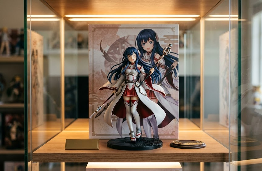
3. Align the visible box art with the figure silhouette
Good display composition depends on what sits behind the figure’s head, shoulders, and main pose lines. If a bright logo, busy character collage, or harsh contrast sits directly behind the face, the sculpt loses visual clarity immediately.
Try to place the most detailed part of the box art around the outer frame of the figure rather than directly behind the face. The cleanest setups usually keep:
- the face against a calmer background area
- weapons, hair arcs, or raised arms away from busy graphic elements
- the strongest color contrast around the figure outline, not under its key details
That is what makes box art feel intentional instead of noisy.
Best Figure-to-Box Size Relationships
Not every figure-box combination deserves a box-backdrop display. Size proportion matters more than most collectors expect.
The best matchups
These usually work well:
- scale figures with moderately sized premium boxes
- prize figures with compact packaging and simple front-panel art
- figures with strong front-facing silhouettes and enough open space around the pose
- boxes where the artwork echoes the figure colors without overwhelming them
The risky matchups
These often look cluttered:
- boxes that are much taller or wider than the displayed figure
- packaging with heavy text blocks, dense collages, or loud promotional graphics
- figures with very wide effect parts placed in front of equally busy box art
- shelves where the figure and box nearly fill the same visible rectangle
A useful visual rule is this: if your eye notices the packaging before the sculpt, the box is too dominant.
How Far Back the Box Should Sit
There is no single measurement that works for every shelf, but the visual principle is consistent. The box should sit far enough back that the figure has a clear foreground role.
What to look for instead of chasing an exact number
Use this checklist:
- the figure’s face is fully visible at normal viewing distance
- the outline of the head, shoulders, and pose reads clearly
- the box art can still be recognized without swallowing the sculpt
- shadows from the box do not darken the figure unnaturally
- the setup still feels balanced when viewed from slightly left or right angles
If your shelf depth is generous, a larger gap usually looks better. If the shelf is shallow, even a small recession can help as long as the figure still reads as the front subject.
For deeper multi-row planning, a shelf-depth guide matters because box displays fail fast when the shelf was never deep enough for layered composition in the first place. If you are measuring a new setup, this shelf depth planning guide for anime figures helps frame how much room you really need.
Lighting and Glare Considerations
Glare is one of the biggest reasons a figure box art display looks worse in person than it did in your head.
Glossy packaging reflects strip lights, cabinet LEDs, and windows far more aggressively than the sculpt itself. That means the box can turn into a bright mirrored patch that steals focus from the figure.
How to control glare without killing the look
- avoid placing strong LEDs so they hit the box front head-on
- use slightly higher or angled lighting when possible
- test the setup from your normal standing and seated viewing positions
- watch for reflections that land behind the figure’s face or torso
- in glass cases, remember you are managing both box glare and panel glare at once
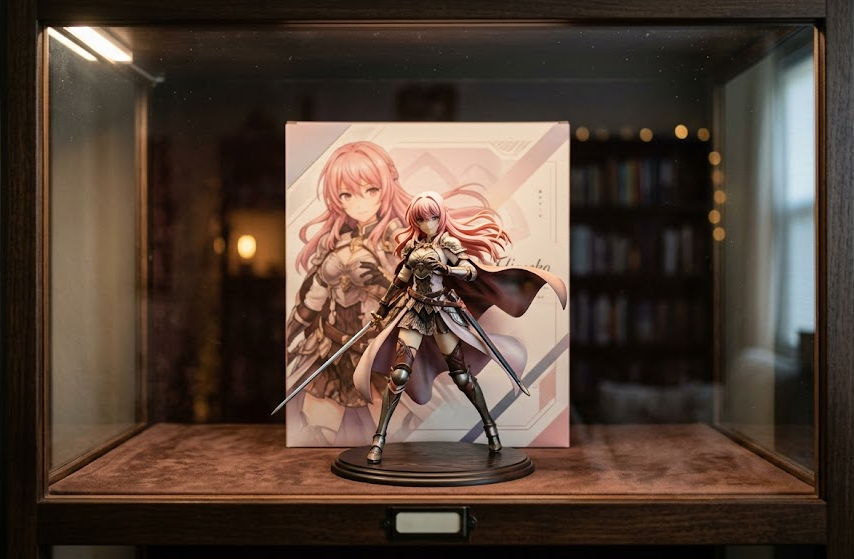
If glare keeps winning, the packaging may be better stored than displayed. A dim, controlled shelf can make box art look luxurious. A badly lit shelf can make the same box look cheap and distracting.
Layering Tips for Shelves, Risers, and Cases
Collectors often think box-backdrop displays only work on wide open shelves, but layering helps a lot. For shoppers exploring this further, see arrange large figures without blocking smaller ones.
Use risers to preserve the sculpt, not just to add height
If a figure is getting visually swallowed by its own packaging, a subtle riser can lift the sculpt enough to restore face visibility and keep the figure silhouette clean. That works especially well for smaller figures with compact boxes.
Keep the front row clean
If you are displaying multiple figures with boxes on one shelf, do not let every item become a full box-backdrop composition. For shoppers exploring this further, see browse display cases. Mix display modes instead:
- one or two hero figures can use box art behind them
- nearby figures can stay box-free to preserve breathing room
- smaller figures can sit on risers without packaging behind them
- larger centerpieces should not be buried inside a wall of repeated boxes
That is usually how anime figure box display ideas stay premium instead of turning into a packaging collage.
In cabinets, watch side-angle readability
A setup can look great head-on and fall apart from a slight side angle. In a case, make sure:
- the box edge does not visually cut into the sculpt
- the figure still has shape definition from off-center views
- neighboring boxes do not create a stacked retail-store look
When Box Displays Look Cluttered Instead of Premium
The line between collector-styled and cluttered is thinner than people admit.
Your display is probably too busy when:
- multiple boxes are equally visible behind multiple figures on the same shelf
- the packaging creates more contrast than the sculpt
- logos, glossy reflections, and color blocks dominate the eye line
- the figure outline disappears into the artwork behind it
- there is almost no empty space between neighboring displays
A simple do and don’t list
Do:
- use the best-looking box art selectively
- keep the figure face and main pose line unobstructed
- create a clear foreground-background gap
- control glare before finalizing the setup
- treat the packaging as framing, not the main attraction
Don’t:
- display every figure in front of every box
- force oversized packaging onto shallow shelves
- center loud logo areas directly behind the face
- ignore side-angle clutter in glass cases
- keep the box visible if it obviously weakens the sculpt presentation
Best Cases Where the Box Should Stay Stored Instead
Sometimes the cleanest move is to store the packaging and let the figure stand alone.
That is usually the better call when:
- the box is dramatically larger than the figure
- the artwork is busy, glossy, or text-heavy
- the shelf is shallow and already crowded
- lighting creates persistent glare that you cannot solve neatly
- the sculpt itself already has enough visual presence without help
If your real goal is preserving the box for value, authenticity, or moving protection, display composition does not need to carry that burden. For shoppers exploring this further, see should you keep anime figure boxes. In those cases, keeping the packaging stored can give you a stronger shelf and safer long-term condition at the same time.
Visual Checklist Before You Commit
Before calling the layout finished, stand back and confirm:
- the figure is still the first thing you notice
- the box art supports the composition instead of overpowering it
- the figure silhouette stays readable from normal viewing angles
- glare is controlled in the actual room lighting, not just in one test position
- the shelf depth creates visible separation between figure and packaging
- neighboring displays still have breathing room
If those points are true, displaying figure with packaging can look intentional, stylish, and collector-grade rather than messy.
FAQ
Should you display anime figures in front of the box?
Yes, if the box art improves the display and the figure still remains the clear focal point. It works best when the packaging acts as a backdrop rather than competing with the sculpt.
How do you make figure boxes look good on a shelf?
Recess the box slightly, control glare, and position the visible artwork so it frames the figure outline instead of sitting directly behind important sculpt details like the face.
Does displaying with the box make a shelf look cluttered?
It can. The display usually looks cluttered when the shelf is shallow, the packaging is oversized, or too many figures use box backdrops at the same time.
What kind of figures look best with box art behind them?
Figures with strong silhouettes, tasteful premium packaging, and enough shelf depth around them usually look best. Smaller figures can also work if a riser restores visibility and the box art is not too busy.
Summary Takeaway
The best way to display anime figures with boxes is to let the packaging frame the sculpt, not fight it. Recess the box, protect the figure silhouette, watch glare, and use the setup selectively. If the figure stops being the star, store the box and keep the shelf cleaner.